CloudFronts develops Power BI ‘DialGauge’ Custom Visual
Introduction
Power BI is a cloud-based business analytics service that enables to visualize and analyze data. Using Power BI users can spot risk, find opportunities at a glance, create personalized reports and dashboard.
Data visualizations in Power BI will allow you to interact with your data to find business insights. We can create and modify visualizations in reports and then pin to the dashboard. A variety of different visualizations like bar chart, column chart, area chart, combo charts, doughnut charts, and funnel charts, etc. can be added to Power BI reports.
With the introduction of Power BI custom visuals, developers can easily add custom visuals into Power BI for use in dashboard, reports and content packs. Custom visuals can be created for yourself and later share it with the community or can be downloaded from Power BI Visual Gallery.
Case Study
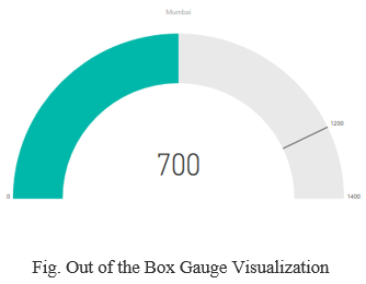
Power BI has out of the box Gauge visual available as shown in the screenshot below. But this does not suffice the requirement for one of our client that needs to have a custom visual something similar to the Gauge with a Dial. This was a necessity to successfully drive the business by analyzing data on the dashboard with the help of this custom Gauge with a Dial.
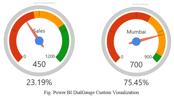
So, our developers had a brainstorming session and figured out how we can approach this particular requirement and meet the needs of the client. It was also a challenge and something new as it was related to Power BI and newly developer tool available for development using TypeScript. So finally after development, debugging and testing the visual, we were successful in implementing our own custom visualization named as DialGauge shown in screenshot below.
We have submitted this custom visualization to Power BI team for publishing to Power BI visual gallery. After verifying the same, Power BI team have published our DialGauge custom visual and currently it is available for Power BI users to download.
Description for custom ‘DialGauge’ visualization is as below:
- Colour indicated by red displays actual value.
- Colour indicated by yellow displays target value.
- Pointer displays any value.
- Null/blank/max values will be indicated by colour green.
- Default minimum value is 0.
- Default maximum value is 100.
- Additional label to display value. It append % sign.
- Name of chart will be displayed on Center of Dial Gauge.
DialGauge visual can be downloaded here.
Check the DialGauge discussion at Power BI blog: