Create a Custom Real-time Loader Control in Canvas PowerApps
In Canvas PowerApps, we usually show an image that lies over the screen until an execution is completed. But tracking real-time update might be confusing.
I’ll show you a simple custom loading control that not only show execution status but also look good and is highly customizable.
Here’s a preview how it will look
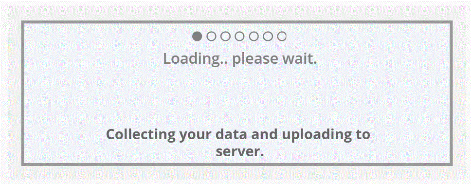
(Note: Determine your layout before hand like X,Y, Height and Width)
(Customize your look, I’ve added dots above just for demonstration purpose.)
How to make this,
Elements used visually are,
- Create a Rectangle as main background and set Height, Width, X and Y. (I’ve used light grey color)
- Insert another Rectangle to show loading animation which will fit inside main Rectangle.
Determine its Height, Width, X and Y. - Label control to show current status or add a simple static label.
- Gallery Control having circle in them i.e.: Dots (Optional, I used to show how i retrieve data as its similar to Navigation Screen Gallery Control used in 1 of predefined template in Canvass PowerApps)
//Fill Property of circle inside gallery control representing dots.
If(Or(ThisItem.Step = 0 && IsBlank(Temp), ThisItem.Step = Temp), RGBA(128, 128, 128, 1), RGBA(0,0,0,0))
Functionality behind used are,
- Gallery Control under ‘Items’ I’ve added table. (Based on your content, keep total count of steps you would like to see in loading page. In my case, i have 6 steps)
Table(
    {
        Step: 0,
        Text: "Collecting your data and uploading to server."
    },
    {
        Step: 1,
        Text: "Verifying content and checking duplicates..."
    },
    {
        Step: 2,
        Text: "Applying Algorithms.."
    },
    {
        Step: 3,
        Text: "Processing..."
    },
    {
        Step: 4,
        Text: "Updating dependencies !"
    },
    {
        Step: 5,
        Text: "Almost completed... please wait!"
    },
    {
        Step: 6,
        Text: "Completed Successfully !"
    }
)- Label Control that shows current status based on current step.
If(IsBlank(Temp), First(XGal.AllItems).Text, LookUp(XGal.AllItems, Step = Temp).Text)- Rectangle with loading animation.
(Note: Your step count and width may vary)
//Width Property
Temp/<number of Steps> * <Total Width when loading is complete>
//I have used,
Temp/6 * 682

//Fill Property
If(Temp = <Last Step>, RGBA(50, 128, 50, 1), RGBA(128, 128, 128, 1))
Now you may have a button that will call list of execution that you will perform.
To track every successful completion of process just add this,
UpdateContext({Temp: Temp+1})
<Your code>
UpdateContext({Temp: Temp+1})
<Your code>
UpdateContext({Temp: Temp+1})
<Your Code>
UpdateContext({Temp: Temp+1})
.... and so on till you complete your max step count.
Later reset count and turn visibility off.
(Note: This is re-usable and can be used as component.)
Hope this helps.