PowerBI April 2018 Update: Combo Chart Line Formatting
Introduction:
PowerBI introduced the feature to format line styles and legends for line charts a while ago. However, these features were not applicable to lines in combination charts like ‘Line and Stacked Column Chart’ and ‘Line and Clustered Column Chart’.
With the April update of PowerBI Desktop, we are now able to customise the format for lines in combo charts to different styles, which then reflect in the legend, making the chart easier to read and understand.
Steps:
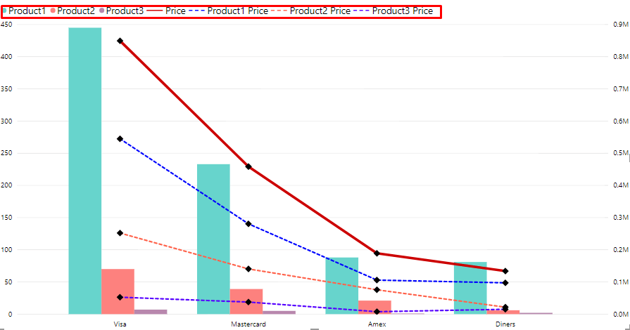
- While using a combo chart, all line series are in the ‘Solid’ format with just the defined colours differentiating them and the legend only displays their respective colours as shown below.
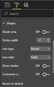
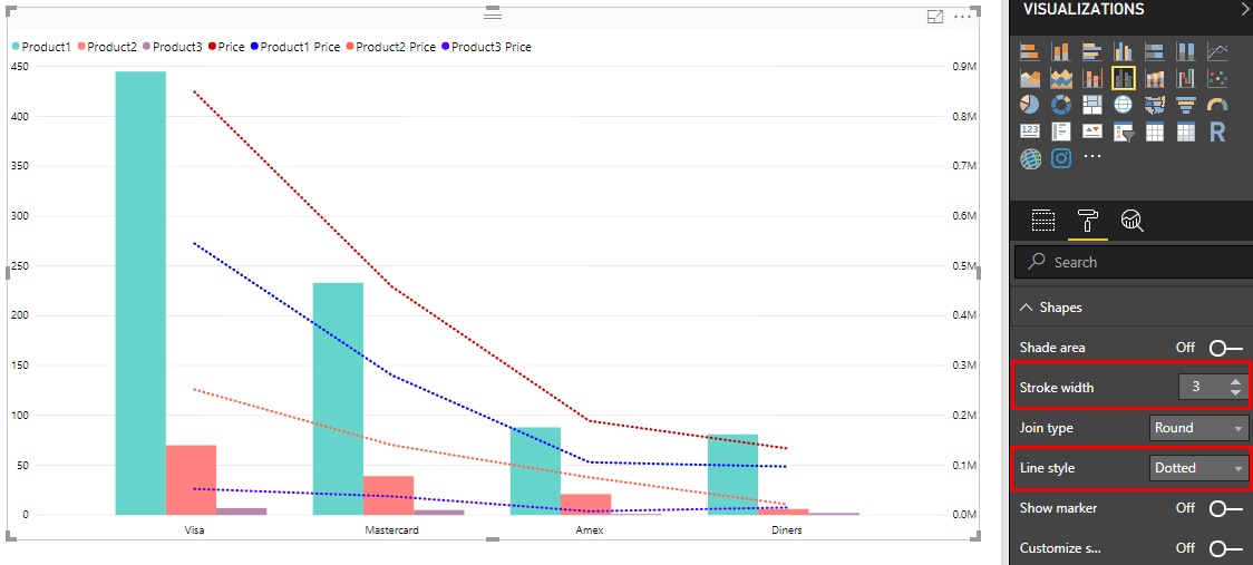
- To format the line or line series, go to the ‘Format’ pane and under the ‘Shapes’ card, you will find several options to customise the format of the lines.
- Shade Area can be switched On to shade the area each line encompasses.
- ‘Stroke Width’ allows you to adjust the thickness of all the lines.
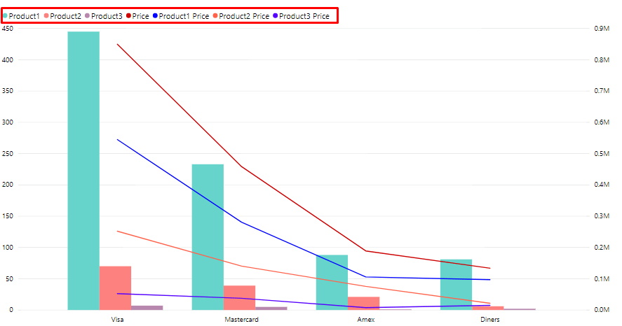
- ‘Line Style’ allows you to select whether the line will be displayed as a solid line, dashed or dotted line as shown below.
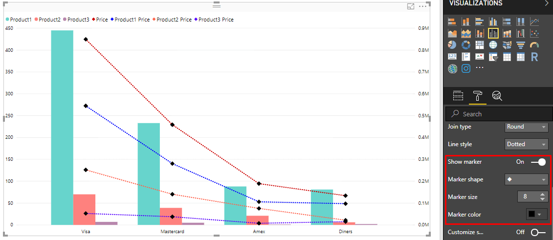
- The next option is ‘Show marker’, which when switched On allows you to select the Marker shape, size and colour.
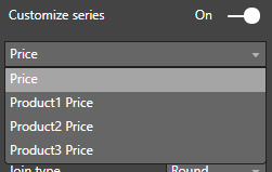
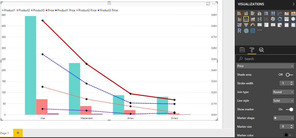
- To customise each line in a series individually, switch On ‘Customize series’. You will get a dropdown to select from the line values and options to customise the format of each line based on the line value selected from the dropdown.
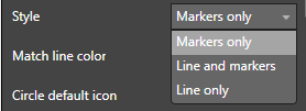
- Coming to the customisation of the legend, you can do so by going to the ‘Legend’ card under the ‘Format’ pane. In the Style option, you have three options in the dropdown menu –
Markers only: This will display only the respective markers in the legend.Line and markers: This will display both the respective lines and markers in the legend.
Line only: This will display only the respective line style in the legend (shown below).
Conclusion:
As we can see, the new April update allows us to completely customise the lines in a combo chart, which not only add more visual appeal but also enables the user to easily read and understand the chart and the data it represents.