From Unstructured Project Data to Executive-Ready Reporting: Transforming Project Reviews with Power BI Matrix Visuals for a Houston-Based Industrial Cybersecurity Provider.
Summary
A Computer Security Service provider based in Houston, Texas needed a better way to review large-scale project reports where financial, billing, delivery, and schedule metrics were difficult to analyze in a flat table structure.
This blog explains how a Power BI Matrix visual was used to create grouped business headers such as:
- Contract & Billing Status
- Schedule Status
- Budget & Hours
- Cost Performance & Forecast
The solution uses:
- Custom DAX mapping tables
- Dynamic SWITCH measures
- Matrix column hierarchies
- Custom sorting logic
The final report improved readability and made project reviews easier by grouping related KPIs into meaningful business sections for leadership and delivery teams.
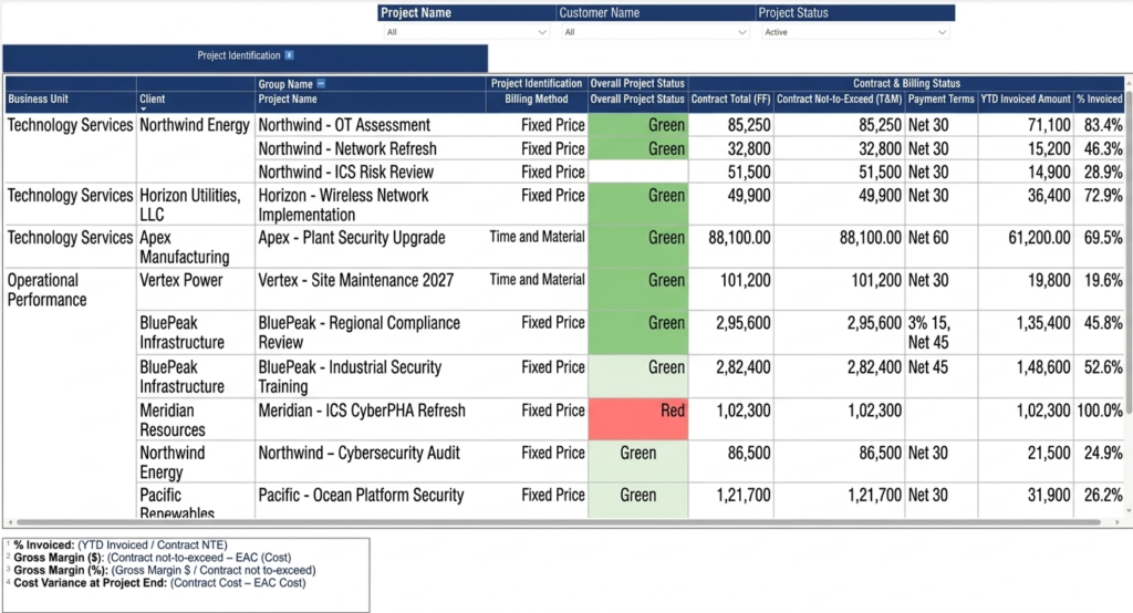
Power BI Matrix visual with grouped business headers
Table of Contents
The Reporting Problem
A company working in industrial infrastructure and operational technology services needed a better way to review project financial and delivery data inside Power BI.
The existing report already contained all required metrics, including:
- Contract value
- Budget usage
- Project schedule
- Billing status
- Margin calculations
- Cost forecasts
Although all required information existed in the report, the layout was difficult to review because every column appeared as a flat list.
During project review meetings, users had to manually scan unrelated columns to understand project health.
The business requested:
- Grouped business sections
- Better column organization
- Formula explanations for KPIs
- Easier financial review
- Structured project reporting
The goal was to organize the report in the same way projects are discussed during operational reviews.
Why Matrix Visual Was Used
Power BI table visuals do not support grouped or merged headers.
To create multi-level business headers, the report had to use a Matrix visual.
This allowed related columns to appear under parent business sections such as:
- Contract & Billing Status
- Schedule Status
- Budget & Hours
- Cost Performance & Forecast
This structure made the report easier to scan during financial and project discussions.
Create a Header Mapping Table
The first step was creating a metadata table that controls:
- Group names
- Column names
- Column order
- Section order
This table drives the Matrix visual structure dynamically.
DAX Table
Project Matrix Headers =
DATATABLE(
    "Group Name ➡️", STRING,
    "Column Header", STRING,
    "Sort", INTEGER,
    "Master_Sort", INTEGER,
    {

    {"Project Identification", "Billing Method", 1, 1},

    {"Overall Project Status", "Overall Project Status", 5, 2},

    {"Contract & Billing Status", "Contract Total (FF)", 6, 3},
    {"Contract & Billing Status", "Contract Not-to-Exceed (T&M)", 7, 3},
    {"Contract & Billing Status", "Payment Terms", 8, 3},
    {"Contract & Billing Status", "YTD Invoiced Amount", 9, 3},
    {"Contract & Billing Status", "% Invoiced", 10, 3}

    }
)
After creating the table:
- Column Header was sorted by Sort
- Group Name ➡️ was sorted by Master_Sort
Without this step, Power BI sorts headers alphabetically, which breaks the business layout.
Create the Dynamic Measure
The Matrix visual uses one dynamic measure that returns values based on the selected column header.
This was implemented using SWITCH().
Dynamic Measure
Project Matrix Values =
SWITCH(
    SELECTEDVALUE('Project Matrix Headers'[Column Header]),

    "Billing Method", MAX(salesorder[Billing Method]),

    "Overall Project Status",
    MAX(msdyn_projects[Overall Project Status]),

    "Contract Total (FF)",
    SUM(salesorder[Total Amount]),

    "Contract Not-to-Exceed (T&M)",
    SUM(salesorder[Not-to-exceed Limit]),

    "Payment Terms",
    MAX(salesorder[Payment Terms]),

    "YTD Invoiced Amount",
    SUM(invoice[Total Amount]),

    "% Invoiced",
    invoice[% Invoiced] * 100
)
Aggregation handling became very important during implementation.
| Metric Type | Correct Aggregation |
|---|---|
| Amounts | SUM |
| Status | MAX |
| Dates | MAX or MIN |
| Percentages | AVERAGE or calculated measure |
Using incorrect aggregation inside the SWITCH measure can produce duplicate totals, incorrect percentages, or unexpected values.
Configure the Matrix Visual
The Matrix visual was configured using:
| Matrix Area | Field |
|---|---|
| Rows | Business Unit → Client → Project Name |
| Columns | Group Name ➡️ → Column Header |
| Values | Project Matrix Values |
This automatically created grouped business headers.
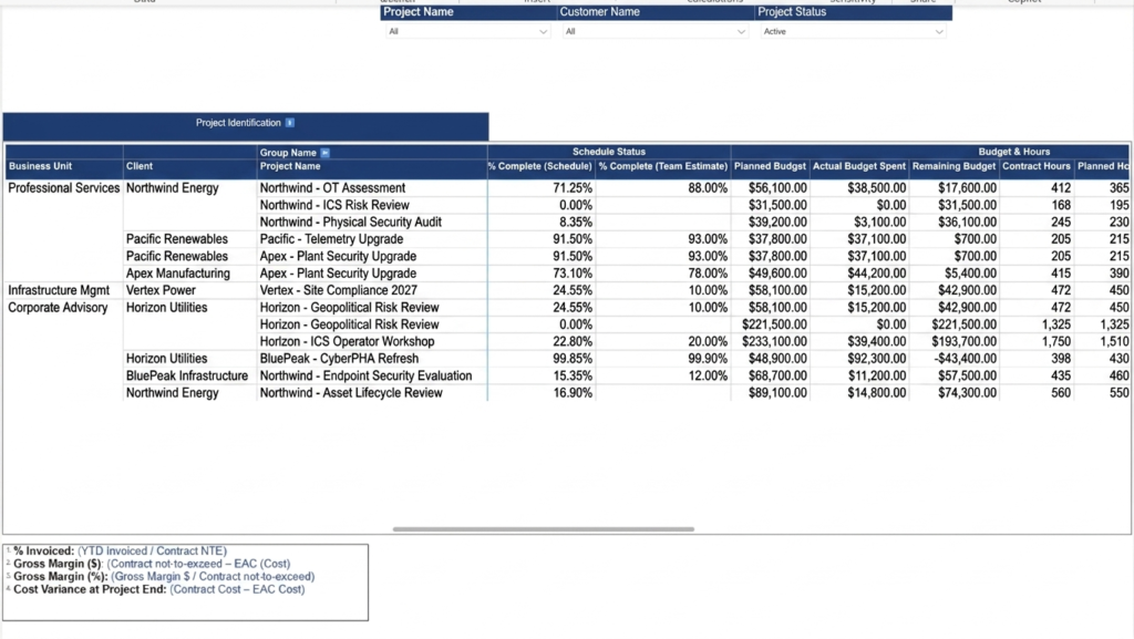
Power BI Matrix visual configured with grouped business headers
Important Limitations and Learnings
Grouped Headers Only Work Properly for Columns
Power BI supports grouped headers only through the Columns section of the Matrix visual.
Dynamic grouping for Matrix row headers is limited.
For example:
- Business Unit
- Client
- Project Name
cannot be dynamically grouped the same way as column headers.
Since these row sections were static, text boxes and manual formatting were used to simulate grouped row labels.
Aggregation Logic Must Be Handled Carefully
The dynamic measure requires every metric to be properly summarized and mapped.
Incorrect aggregation logic can produce:
- Incorrect totals
- Duplicate values
- Wrong percentages
- Blank results
This becomes especially important in financial and project reporting where different KPIs require different summarization methods.
Matrix Visual Performance
Large Matrix visuals with many dynamic measures can become slow.
Performance was improved by:
- Reducing unnecessary measures
- Avoiding repeated calculations
- Using summarized tables
- Keeping hierarchies simple
Frequently Asked Questions
Can Power BI tables create grouped headers?
No. Standard table visuals do not support grouped or merged headers.
The Matrix visual is required for this approach.
Why use a Matrix visual instead of a Table visual?
Matrix visuals support hierarchical columns, allowing related KPIs to appear under common business headers.
Does Power BI support dynamic row grouping?
No. Dynamic grouping for row headers is limited.
Static row sections usually require text boxes and manual formatting.
Why do Matrix values sometimes show incorrect totals?
This usually happens because aggregation logic inside the SWITCH measure is incorrect.
Each KPI must use the proper summarization method such as:
- SUM
- MAX
- MIN
- AVERAGE
- Dedicated calculated measures
Conclusion
Power BI Matrix visuals can be used to create structured multi-level business headers for large operational reports.
By combining:
- Matrix hierarchies
- DAX metadata tables
- Dynamic SWITCH measures
- Custom sorting logic
large reports can be organized into meaningful business sections that are easier to review and maintain.
The most important learning from this implementation was understanding the limitations of Matrix visuals and handling aggregation logic carefully.
When implemented correctly, this approach makes project and financial reporting significantly easier for leadership teams to use.
We hope you found this blog useful. If you would like to discuss similar Power BI visualization solutions, feel free to connect with us at transform@cloudfronts.com.