
Summary
Our client is a US-based manufacturer of premium connected countertop cooking appliances, sold direct to consumers and through retail partners. Their in-house support team works warranty, returns and device troubleshooting cases in Dynamics 365, but the rules for handling those cases lived outside it, in documents that had to be opened in a second tab.
We built what they call the troubleshoot guide using the side pane, a part of the app shell most implementations never touch because the out of the box app only uses it for the productivity pane and the Copilot panel. A Quick Reference Guide icon in the right-hand rail opens a business rules library beside the record, it stays open while the agent moves from one case to the next, and it is edited in place by the people who own the rules. The content sits in Dataverse rows instead of in a solution, so adding or correcting a rule is a data change rather than a deployment. This post covers why we chose that surface, the two design calls we reversed mid build, and the limits we would design around on a second pass.
Table of Contents
Business Challenges
The problem was never that the rules did not exist. The problem was where they sat relative to the work.
- The handling rules lived in documents outside CRM, so finding the right paragraph meant leaving the case form and giving up the record context
- Rules changed more often than anyone could republish them, and a correction had to go back through whoever owned the file
- Nothing tied a rule to the moment it was needed. The agent already had the case open and still had to remember which policy applied
- Anything that put the content on a form tab would have turned a typo fix into a customisation, an export and an import
Solution Overview
The troubleshoot guide is a side pane. Most users only ever meet that surface as the productivity pane in Customer Service, and most project teams reach for a dialog or a form tab because those are the shapes everyone already knows. The pane is the only one of the three that keeps the reference material and the record on screen together.
The entry point is a Quick Reference Guide icon in the right-hand rail of the app. It is there as soon as a case is opened and on a case the agent is still creating, so somebody taking a call does not have to save the record first.
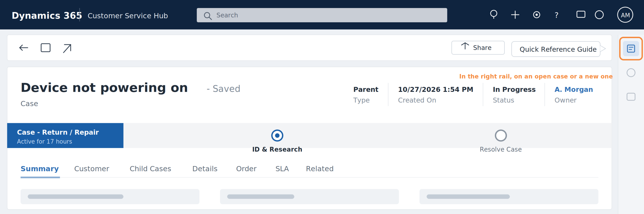
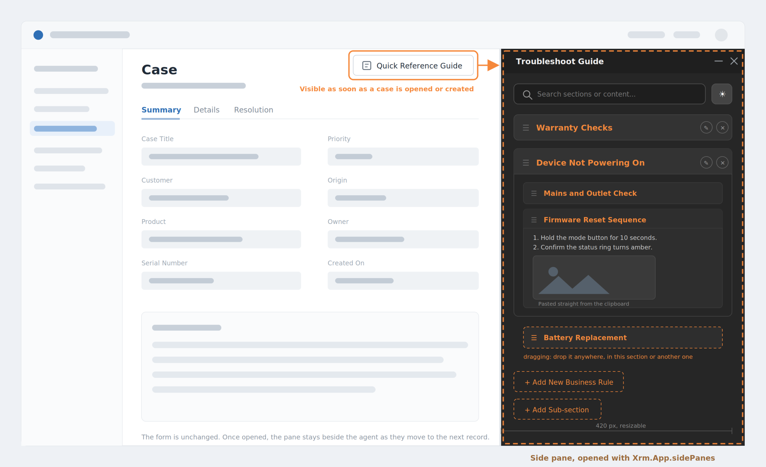
One click opens the pane, and it stays pinned as the agent moves to the next record. Content is organised in two levels: a business rule heading, and sub-sections under it, all collapsed when the pane first renders so the agent sees the index before the detail.
What the pane does
- Two level structure. A business rule heading holds any number of sub-sections. Everything renders collapsed, so the agent reads an index first and opens only the rule they need
- Search across both levels. One box matches heading names and the body text of every sub-section at the same time, and auto-expands whatever it hits. Clearing the box restores exactly which sections were open before the search started
- Inline authoring. Add a heading, add a sub-section, write bold text, colour a warning line, insert a link. No second screen and no admin rights
- Insert images two ways. Upload from the device, or point at an existing URL. Either way the image is resized and compressed before it is stored
- Paste from Word and Outlook. The rule owners draft in Word. Pasted formatting is cleaned on the way in, and a screenshot sitting in the clipboard is embedded as part of the same paste
- Sort by dragging. Headings reorder against each other, sub-sections reorder within their heading, and the new position is saved the moment the item is dropped
- Move a sub-section to a different heading. Drag it out of one section and onto another. A collapsed heading opens itself when the item hovers over it, so nothing has to be expanded first
- Light and dark themes. A toggle in the pane header, remembered per browser, because the pane is open all day beside a form whose theme the agent does not control
- Delete that deactivates. Removing a heading deactivates its sub-sections first, then the heading, so nothing is orphaned and nothing is destroyed
Technical Approach
Why the side pane and not a form tab
We looked at three places to put the guide before writing anything. The deciding criterion was not how it looked, it was what survives the agent moving to the next record.
| Criteria | Form tab | Custom page dialog | Our choiceSide pane |
|---|---|---|---|
| Readable at the same time as the case fields | partial | ✗ | ✓ |
| Survives navigating to the next case | ✗ | ✗ | ✓ |
| Width the agent can drag to suit their screen | ✗ | ✗ | ✓ |
| Keeps scroll position and open sections between records | ✗ | ✗ | ✓ |
| No change to the form layout to adopt it | ✗ | ✓ | ✓ |
The side pane has been available in the Dynamics 365 app shell since 2021 and almost nothing in the standard app uses it beyond the productivity pane and Copilot. That is the only reason the column on the right feels unfamiliar. It is a supported extension point, not a workaround.
How it is put together
- TriggerQuick Reference Guide iconIn the right rail, on an open case and on a new one
- ShellSide panePersists across record navigation
- UIHosted guide pageHolds the search, the editor and the drag behaviour
- DataDataverse Web APIReads on open, writes on every edit
- StoreTwo custom tablesHeadings and sub-sections, active rows only
Two custom tables carry everything. One holds the heading and its position. The other holds the sub-section title, its formatted body, its position and a lookup back to its parent heading. No plugin, no custom API, no Power Automate flow sits behind them, which is why a rule change costs nothing to publish and why the whole library renders from a single pair of reads.
Two decisions we reversed
The first build opened the pane automatically when the form loaded. Walk through four cases and the agent ends up with four panes, because that event fires on every load and the shell is happy to create another one each time. We moved the trigger to an icon the agent clicks, and made the command look for the pane before it creates anything, so a second click brings the existing one forward. The pane also had to be configured to keep its state, otherwise collapsing and reopening it reloads the whole library and the agent loses their place in a long rule.
The second reversal was the editor. The rule owners draft in Word, so screenshots arrive by paste. Our first version accepted the pasted formatting and saved cleanly. The images were gone the next morning, because Word points at a copy of the picture on the author’s own machine and that reference means nothing once the content is sitting in a Dataverse column. The editor now ignores those local references and takes the actual image out of the clipboard instead.
Designing for a 420 pixel column
A pane is not a page, and most of the fiddly work came from that. Images are resized and compressed before they are stored, with a hard ceiling that refuses anything still too large after three passes, because an embedded screenshot travels with its row on every load. A single uncompressed photo from a 4K monitor would have outweighed the entire rest of the library.
Drag and drop needed the same care. Items are picked up by a grip rather than anywhere on the row, so an agent can still select and copy a line of text. A collapsed heading opens itself when something hovers over it, because in a narrow column most headings are closed and would otherwise be impossible to drop into. The move appears on screen first and is saved straight after, and if the save is rejected the pane rolls back to the last known good state rather than showing an arrangement nobody stored.
Where this design stops
- The pane is a model-driven app surface. There is no equivalent in a canvas app and none on the mobile client, so a field team needs a different delivery
- The launcher is wired to the case, so the guide is reachable from a record rather than from a dashboard or a view. Making it available everywhere in the app is the obvious next step and was out of scope for this release
- Reordering a long list writes one update per row that shifted. It is correct and it is wasteful, and batching those writes is the first change on our list
- The current shape holds comfortably at a few hundred rules. At a few thousand the library needs to load rule bodies on demand rather than up front, and images need to move out of the content and into file storage
Impact
- 1Click from the right rail to the full rule library
- 2Reads to render every heading and rule
- 420pxDefault pane width, dragged wider by the agent
- 0Developer hours to publish a rule change
The figure that matters most to the client is not in that row. It is the one below, and it is the reason the rule owners stopped filing tickets to get a sentence changed.
Rule text is row data, not a web resource and not a form customisation. The pane writes it straight to Dataverse, so a correction goes live the moment the author clicks Save.
- Open a separate document to find the handling rule
- Case form loses focus, and the record context goes with it
- A correction routes back to whoever owns the file
- One click in the right rail opens the guide beside the form
- One search matches headings and body text in a single pass
- The rule owner edits in the pane and saves straight to Dataverse
- ◆The right column is free real estateA supported extension point puts anything an agent reads while working a record next to that record, with no change to the form they already use.
- ▣Let the agent open itAn icon the user presses beats a script that opens things for them. No duplicate panes, and no column taken over on records where nobody wanted it.
- ⬒Content tools fail quietlyAn editor that accepts a Word paste can look correct on save and be broken by the next morning. That class of bug is found by using it, not by reviewing it.
Conclusion
Version two is already scoped, and it is mostly about load shape: batch the reorder writes, fetch rule bodies on demand, move images into file storage. None of that changes what the agent sees, which is the point. The design was built to be cheap to run at the size this team works at, not to be impressive at a size they will never reach.
Two things we would keep. The pane, because once the reference material stopped competing with the form for the same screen the whole argument about where to put it went away. And the editor, because giving the rule owners a place to write rather than a request form that reaches us is what keeps the guide accurate enough to be worth opening.
Let’s Talk
Put the answer beside the record, not behind a tab
If your Dynamics 365 users are reading policy, rules or scripts in a second window while a record is open, write to us at transform@cloudfronts.com. We will walk you through what the same content looks like as a side pane they can edit themselves, and what it would take in your environment.
Connect With UsAuthor Profile

Shruti Gupta
Senior Consultant · CloudFronts
I am a Senior Consultant at CloudFronts with 5+ years of experience in Azure integrations and Dynamics 365 implementations. She specializes in building seamless, API-driven architectures and connecting enterprise systems across the Microsoft ecosystem. Passionate about solving complex integration challenges, she focuses on delivering scalable, production-ready solutions that drive real business outcomes.