PowerBI Visuals: ArcGIS
Introduction:
In this blog article, I will demonstrate how to enable ArcGIS in PowerBI, its features and how to use it to display data.
The ArcGIS Visual, created by Esri, displays data in a unique and immensely customisable way. The Visual allows the User to select the type of map, various ways to represent data points and additional features like distance mapping and reference layers to make the visual interactive and informative.
In order to enable ArcGIS, the User must agree to Esri’s terms and conditions.
Enabling the ArcGIS Visual:
To do this in PowerBI Service, go to the ‘Settings’ menu.
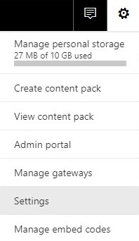
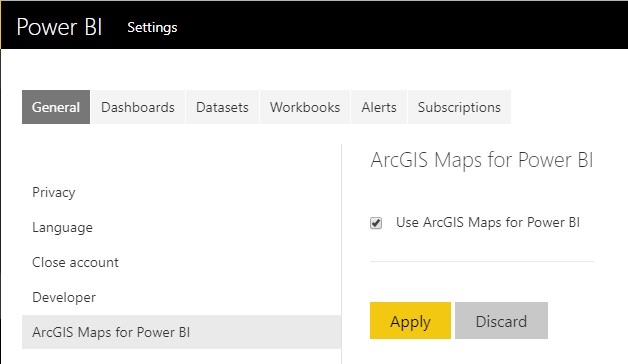
Select ‘ArcGIS Maps For PowerBI’ and select the checkbox next to ‘Use ArcGIS Maps for PowerBI’. Click Apply.
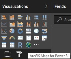
Now you can go to the ‘Editing View’ and select the ArcGIS icon from the Visualisations Pane.

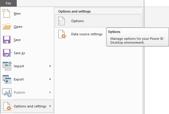
To enable it in PowerBI Desktop, select ‘Options and Settings’ in the File menu.
Select ArcGIS Maps for PowerBI in the Preview Features section.

Now, select the ArcGIS icon in the Visualisations Pane to get started.
Using the Visual:
After loading the data into PowerBI, drag your data in the appropriate fields in the Fields pane.
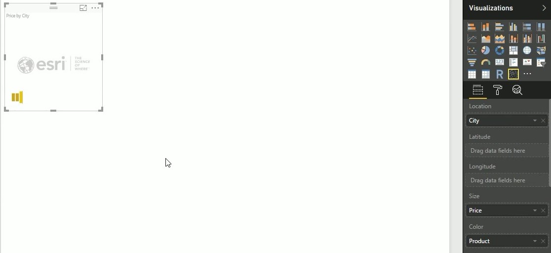
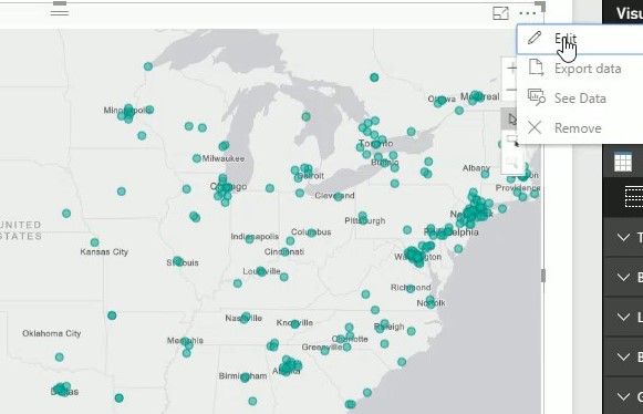
Now here is where the fun begins! Click on the ellipses and select the ‘Edit’ option to start customising your visual.
A task pane appears at the top of your visual.
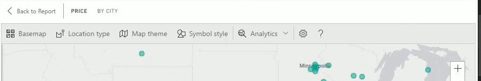
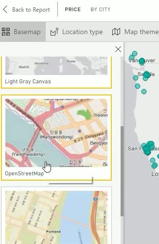
The first option is ‘Basemap’. In this option, you can select the type of map you would like to use and that would best showcase your data.
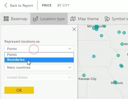
The next option is Location Type. Here, you can select how you want your location data represented. Points will show you data points and Boundaries will display data by state boundaries.
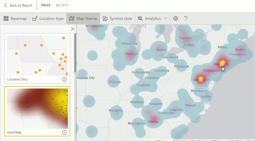
Map Theme, the next option, will let you select different visual ways to display trends in your data. ‘Size’ displays points variating by size based on your data, while ‘Heat Map’ shows where the values are high, medium and low by color.
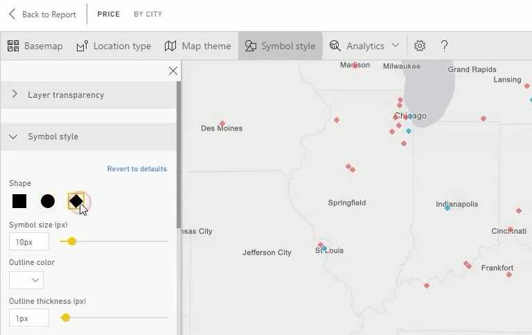
Symbol Style allows you to select which symbol you want to use to represent the data and customise the symbol by style and size.
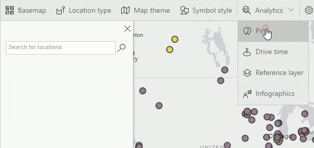
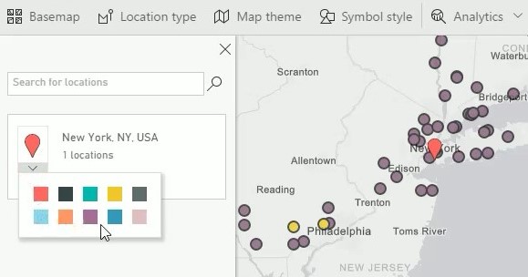
Pins allow you to highlight locations in your map that you want to showcase other than what your data is displaying. Just type the location in the search bar and select the correct location to add a pin there. You can also change the color of the pins if required.
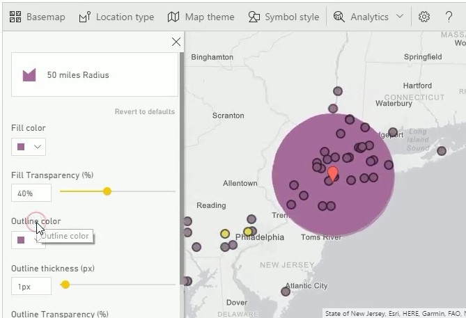
The Drive Time option allows you to show which data points are within a given distance or driving time from a pin. This feature can also be customised by selecting color, transparency and outline preferences.
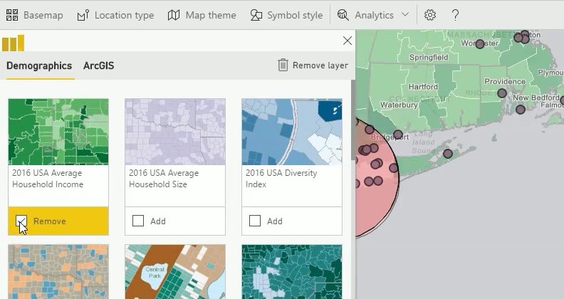
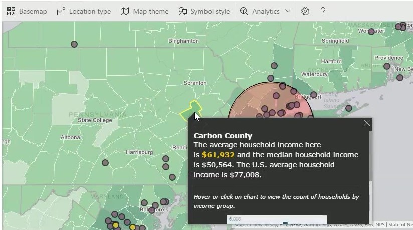
Reference Layer is a feature that allows you to add data to the map based on common statistics like the country’s population, gender ratio and various other demographics like age and diversity. This allows the user to add more information to their map that could be of significance to the data being represented. One can also hover over states to see the reference data of that state.
Conclusion:
As you can see, the ArcGIS Visual is designed to make your data easy to understand and interactive while providing additional relevant data. Its customisability combined with its power-packed features makes this one visual that could really add immense value to any report or dashboard.