How to create a Gantt Chart or Progress bar inside a Table in SSRS
In this article, we will create a Gantt Chart or Progress bar inside a table in SSRS .
In SQL Server Reporting Service does not allow a report programmer to modify a “width” property at run time. The challenging part of this task is how to create a scale and how to create a progress bar that spans a start date and end date. But SSRS have a range bar chart that will help you to make a Gantt chart or progress bar. And display diamond shape if start date and end date is same.
For creating Gantt chart, we need a Data source, a Dataset, a Table and a Range Bar chart.
Steps
Step 1: First create a new data source.
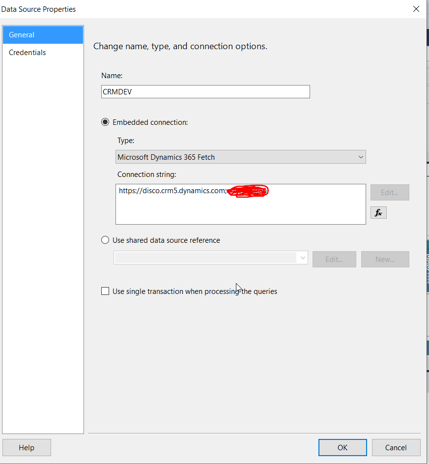
Step 2: Before creating a data set, we need to write a Fetch XML query that created the data we’re going to work with.
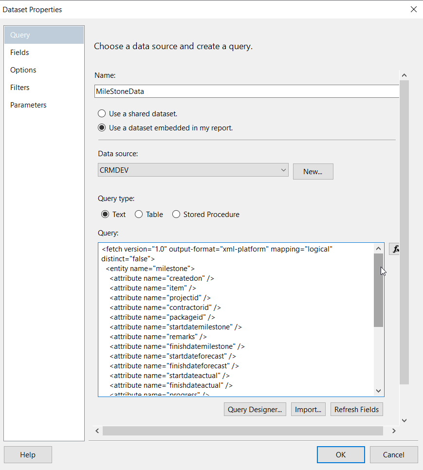
Fetch XML Query:
<fetch version=”1.0″ output-format=”xml-platform” mapping=”logical” distinct=”false”>
<entity name=”milestone”>
<attribute name=”createdon” />
<attribute name=”item” />
<attribute name=”projectid” />
<attribute name=”contractorid” />
<attribute name=”packageid” />
<attribute name=”startdatemilestone” />
<attribute name=”remarks” />
<attribute name=”finishdatemilestone” />
<attribute name=”startdateforecast” />
<attribute name=”finishdateforecast” />
<attribute name=”startdateactual” />
<attribute name=”finishdateactual” />
<attribute name=”progress” />
<attribute name=”status” />
<attribute name=”durationdays” />
<attribute name=”sequencenumber” />
<attribute name=”milestoneid” />
<order attribute=”item” descending=”false” />
<filter type=”and”>
<condition attribute=”projectid” operator=”eq” uiname=”ABC” uitype=”pmtracker” value=”{86AF05D9-6962-E911-A834-000D3A07F3D7}” />
</filter>
</entity>
</fetch>
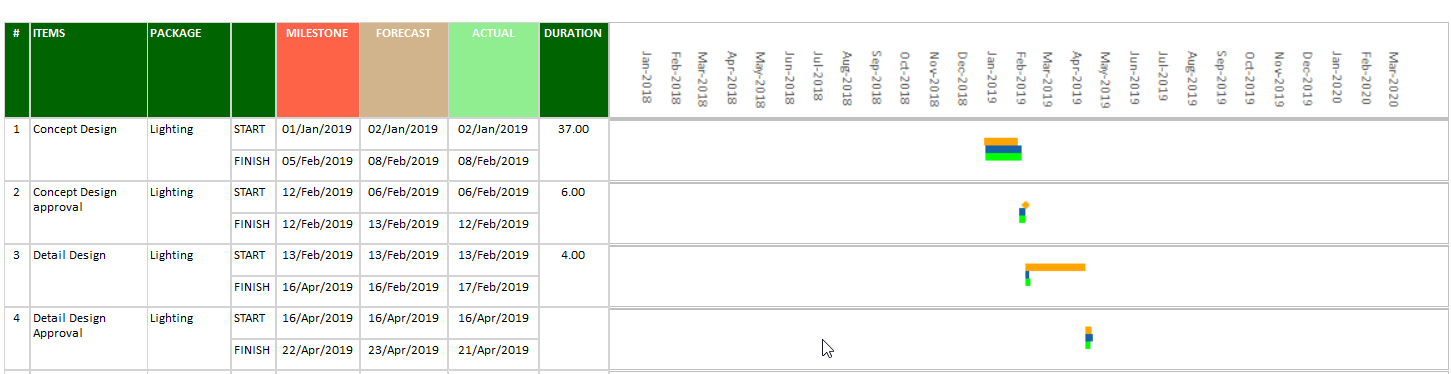
This gives us a result set like this :
| Sequence Number | Item | Package | Start Date(Milestone) | Finish Date(Milestone) | Start Date(Forecast) | Finish Date(Forecast) | Start Date(Actual) | Finish Date(Actual) | Duration(Days) | Status |
| 1 | Concept Design | Lighting | 02-01-2019 | 06-02-2019 | 03-01-2019 | 09-02-2019 | 03-01-2019 | 09-02-2019 | 37.00 | Completed |
| 2 | Concept Design approval | Lighting | 13-02-2019 | 13-02-2019 | 07-02-2019 | 14-02-2019 | 07-02-2019 | 13-02-2019 | 6.00 | Completed |
| 3 | Detail Design | Lighting | 14-02-2019 | 17-04-2019 | 14-02-2019 | 17-02-2019 | 14-02-2019 | 18-02-2019 | 4.00 | Completed |
| 4 | Detail Design Approval | Lighting | 17-04-2019 | 23-04-2019 | 17-04-2019 | 24-04-2019 | 17-04-2019 | 22-04-2019 | Delay | |
| 5 | Tender Issue | Lighting | 29-05-2019 | 31-05-2019 | 01-06-2019 | 03-06-2019 | 01-06-2019 | 03-06-2019 | Delay | |
| 6 | Tender Return | Lighting | 31-05-2019 | 22-06-2019 | 03-06-2019 | 03-06-2019 | 03-06-2019 | 24-06-2019 | 21.00 | Completed |
Step 3: Now we create a Data set from this query:
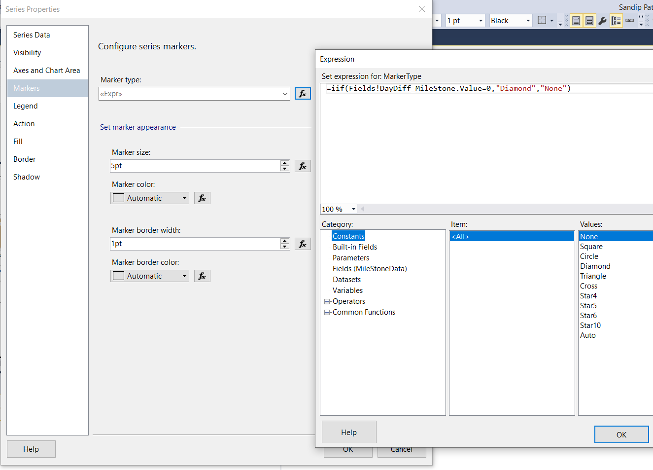
If start date and end date is same then need to display diamond shape, for that we have to add three calculated field.
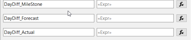
Need to find number of days between two dates.
DayDiff_MileStone=DateDiff(“d”,Fields!startdatemilestoneValue.Value,Fields!finishdatemilestoneValue.Value)
we are going to set the following properties:
We’re going to create a table within the report that has a column for each of the columns in the data set, plus a column for a graph.
We just have to bind the Table to the data set “MilstoneData”
Then drag the columns of the data set to the columns of the table.
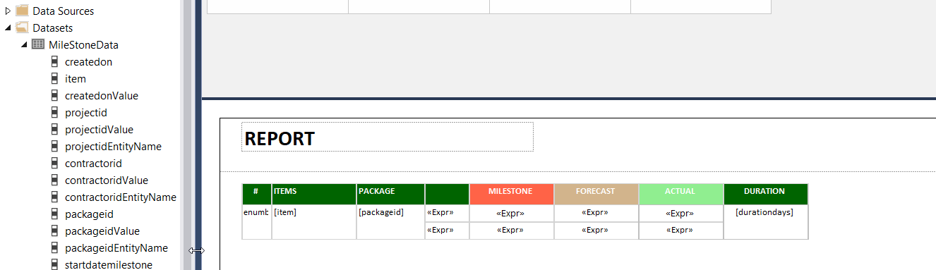
Step 4 : Build the Gantt Chart
SSRS have the Range Bar Chart option.
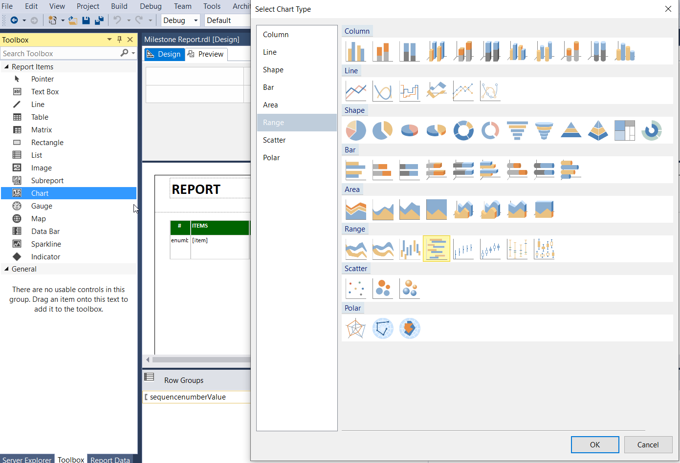
Just drop the chart onto a blank area of the report. We’ll fit it into table later.
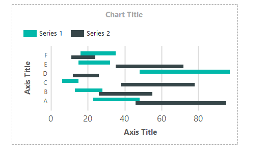
Now we are going to take fewer part of the chart. We’re throw away of:
- The chart title
- The legend
- The vertical Axis title
- The vertical axis
- The horizontal axis title
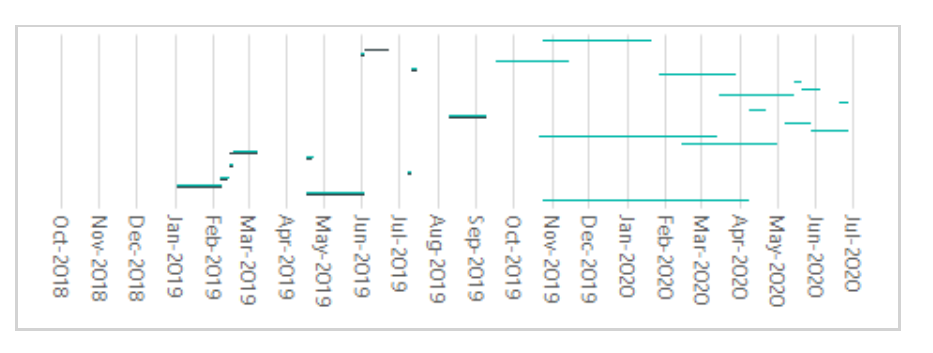
When we’re done, the chart should look like this:
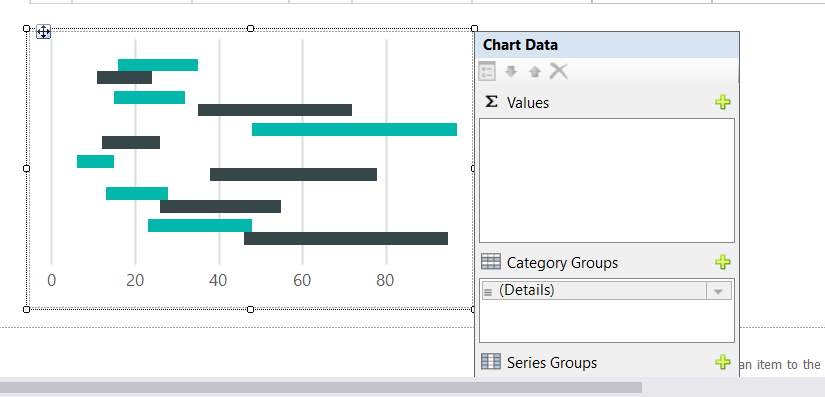
Let’s start setting up the chart.
The first thing we need to do is set the Minimums, Maximums, Intervals and Interval Types.
The client wants minimum date must be from “startdatemilestone” date and maximum date should be “finishdateforecast” date.
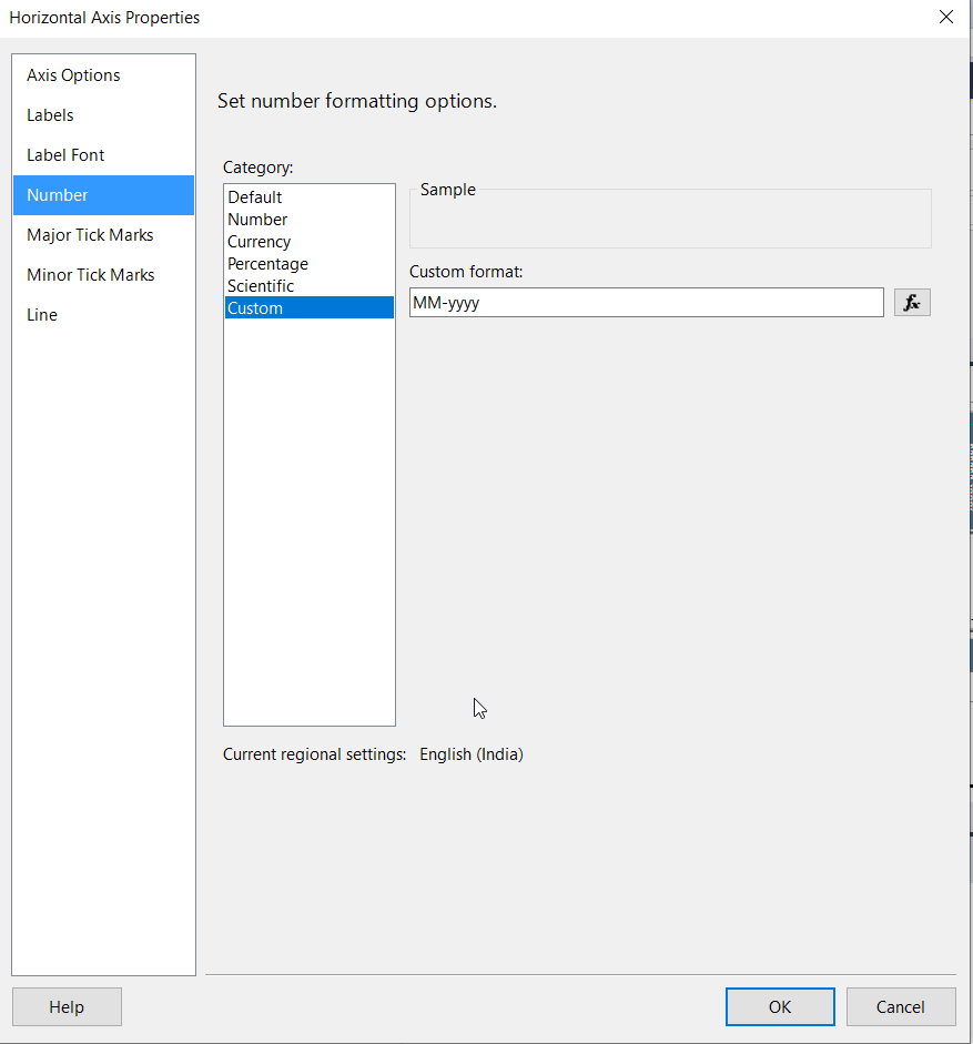
On the Horizontal Axis, we are going to set the following properties:
| Minimum | =DateSerial(Year(Min(Fields!startdatemilestoneValue.Value, “MilestoneData”)), Month(Min(Fields!startdatemilestoneValue.Value, “MilestoneData”)), -1) |
| Maximum | =DateSerial(Year(Max(Fields!finishdateforecastValue.Value, “MilestoneData”)), Month(Max(Fields!finishdateforecastValue.Value, “MilestoneData”)) , 0) |
| Interval | 1 |
| Interval Type | Months |
Also going to set the format the of items along the Horizontal Axis to MM-yyyy
Go to chart series properties, set Marker properties.
Let’s get a preview of the report and see how we’re doing.
It’s correct, but it doesn’t provide the milestone data. Now cut the chart and paste it into the details row of the Table, in the right most column. Now we’re going to run a preview.
OOPS!
We receive the error “The chart has a detail member with inner members. Detail members can only contain static members.
What this means is that chart cannot live in a detail row.
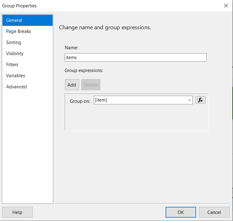
We’re going to create a Group that contains only a single Item.
After selecting the Table, at the bottom left of the screen, we find “Row Groups”,
Just click on preview shows us:
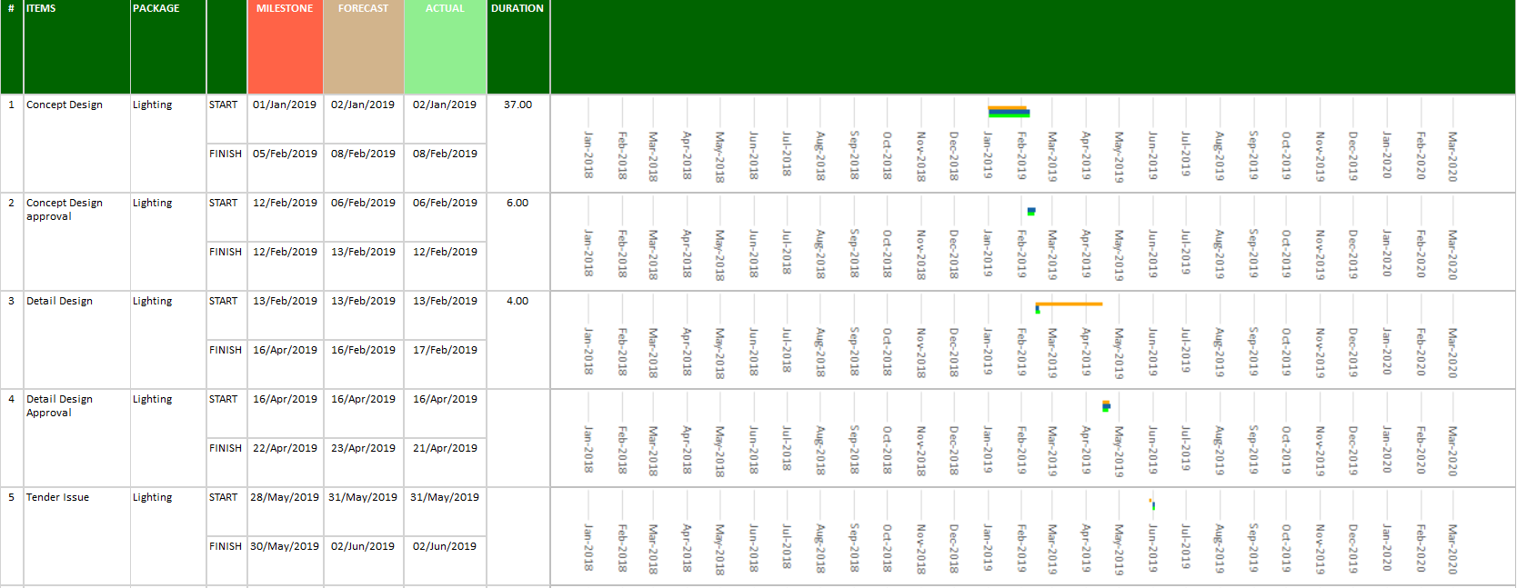
Nice-looking but do we really need a timeline on every now?
Now we are going to need a timeline. So, let’s take a copy of the Chart and put it right next to the header “Duration”
Now we can hide the Axis Labels on the chart in the footer. We can also change the Axis line style to none.
Click on preview
Wow! Hope this helps you!
Check out my other blog here https://www.cloudfronts.com/performing-update-operation-in-microsoft-dynamics-nav-through-integration-in-scribe-online/